
There was a final task to complete before my John Lewis Home Design Stylist could formulate a plan: to choose colours for my home.
Colour schemes for my previous homes over the years had usually reflected the era of their construction and their location. Neutral shades brightened with colourful accessories were applied to my 21st-century new-build apartment. Stark white walls adorned with a multitude of paintings featured in my 1920s apartment when living in Scandinavia. Had the renovation of my South London Victorian cottage ever been completed, it would have been decorated with a flourish of rich reds, greens and blues. The question of how to apply colour to a traditional English thirties house in an authentic way was a new field of research for me.
I typed “nineteen-thirties colour palettes” into several internet search engines and got a range of results. Despite the variation amongst the responses, I found after sifting through them that they largely agreed on the inclusion of dusky pastel shades and neutral tones. There was also a recurring emphasis on greens and blue-greens, muted pinks and mauves, yellows, orange and reds. I found that range interesting and yet conflicting. I wondered how it had come about.
During that decade, as I’d been learning, there was more than one style co-existing. In Britain, the desire for a healthy manner of living featuring the outdoors and nature led to an emphatic use of green. At the same time, the style which came to be later known as ‘Art Deco’ was still flourishing. Its diverse mix of influences including the Ballets Russes, archaeological discoveries of Egyptian treasures and interest in Japanese art and design – Japonism – led to vibrant reds, yellows, greens and blues and black coming to the fore.
In reality, I had a wide range of colours to work with. To narrow down what might suit my own house, I started to ponder memories of the colours in that childhood home.
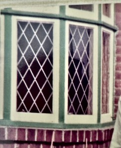
I remembered green featuring throughout the house and especially so with the exterior woodwork. I had watched my father blow-torch and scrape away layers of paint from wooden window frames to reveal several shades of green. Then I saw the woodwork being re-painted partly in white and partly with a green of his personal choice.
My mother’s response to all of this was to mutter the phrase – or sometimes to sing it – “forty shades of green”. (That owed more to the Irish singer Val Doonican than it did to Johnny Cash!)
So green was the first colour to go on my list. I’d been encouraged by my Home Stylist to find images – whether from retail websites or from artworks – to illustrate colours which appealed to me. One day, just as I was taking a short-cut through the furniture department in Harrods in London (yes, really, but it’s too long a story to explain!) my eyes fell upon a beautiful marble-topped dining table. It was surrounded by chairs upholstered in the richest dark green velvet. I knew instantly that this would become my theme. The furniture was made from cherry wood stained a rich, red-brown colour. It seemed to perfectly capture the richness and warmth I wanted my home to possess.
The furniture I was looking at had been designed and produced by the French company Roche Bobois. The design range on display was named Eden Rock. I was given a brochure by a member of the sales team and that booklet became the mainstay of my home design inspiration.

I had started the process of better understanding the factors influencing colour palettes of the nineteen thirties. As a result, I felt better prepared to choose colours for my own home.
I still had more specific ideas and requirements for certain rooms, but at least I had a starting point. The image in that little brochure would serve as the foundation for planning my main living areas.
The design process was really getting underway!
A.P. 9 September 2024
Photo Ownership:
Window: Privately owned photograph.
I
